Showing posts with label Kuretake Clean Colour Real Brush pens. Show all posts

Saturday, 21 October 2017

Stampathon - Part 2 - Gingerbread Lane!

So, following on from my Halloween cards, I set about making some samples with another great BRAND NEW stamp set from Craftwork Cards. This time the gorgeous Gingerbread Lane stamps! These stamp designs were hand drawn by Steph Morgan, Senior Designer up at CWC HQ and they're so lush - Go Steph!

There's lots of different styles and sizes of gingerbread houses, a darling little street sign and 3 little accents they're just so cute! 
 
This was an ideal opportunity for me to get my colouring pens out! I chose to use my Kuretake Clean Color Real Brush pens - well I had to as I'd already stamped in Versafine Onyx Black and I would have needed to use my memento if I wanted to use the Copics.

So I set about stamping lots of the houses on both cream and white cardstock so I could sit and colour whilst watching television. I also stamped some onto kraft cardstock with versamark sticky ink and embossed in gold to give a true gingerbread look without having to colour in. 

You'll see from the samples that I made, I stuck with traditional gingerbread for some of them but then for others chose a different, contemporary colour scheme for a modern, different looking card. Just goes to show how far these stamps with stretch!

So, here goes...

For this card I covered the base card in a spotty paper I printed out from the CWC Festive USB. I had no idea how far this USB would stretch across other stamps, kits and collections! Then I've layered up the gold embossed gingerbread houses with some of the trees and the little street sign. This was quite a quick card to start off with as there was hardly any colouring. I've just used a white gel pen to highlight some of the designs on the houses and the street sign. I think that really sets it off. 


This second card I've stamped in black Versafine and coloured in with the Kuretake pens. I've coloured then n traditional gingerbread colours to keep it traditional. I've cut a square aperture from the base card, stamped the accents on the front and doodled around the aperture. I've attached two of the houses on the outside of the aperture and then stuck one to the inside of the card on a square of kraft cardstock. This way gives a bit of depth and dimension to the card and also leaves some of the design on the inside when the card is open, which as cardmakers, we don't always do.


Similar to the last card, this time I've cut a circle aperture from the front of this card and inked around the edge, then added dots of stickles glitter glue all around the outside. This time I coloured the houses in shades of pink. I've added some of the small pink trees to the foreground along with the little street sign. If you look closely (it was difficult to capture in the photograph) you can see I've added stickles stardust glitter glue to the foreground also to look like glistening snow. Quite a CAS card. Really like this one!

Last by but no means least, I've saved my favourite for the last one again!! This one took a little more work and construction - and definitely a lot more colouring on the inside of the card!!


Okay, so this is the front of the card as you'd see it when it came out the envelope! Very simple and understated. A simple warm grey line drawn for a hill, 3 trees stamped and shadows drawn in, along with the street sign and some snowflakes. Keeping it very clean and simple.


This card is actually made of two cards sandwiched together. The outer card has the stamped images and the front cover design and the inside card has the strutts cut to make the houses pop up. The inside has a piece of black card with silver embossed stars on it and the strutts have all been coloured in black so they blend into the background. The strutts have all been cut at different length, heights and widths so the houses stand out differently.


In this photograph you can see the card from the front. I've done some more wobbly lines with a feint warm grey pen and added stickles glitter glue to the lines to look like snow. I've done this in the shadows at the foot of all the houses too.

I hope you like these cards - there's more stamping to follow so I hope you're enjoyed my stampathon diary!

Happy stamping!!


Wednesday, 18 October 2017

Stampathon - Part 1 - Spooky!!

So, I had a bit of a stampathon recently! I received some BRAND NEW stamps from Craftwork Cards to make some DT samples and had so many ideas for them I just couldn't stop stamping and cardmaking!!

So, there were 4 sets
1. A halloween set (with gorgeous images!)
2. Gingerbread Lane - with an array of amazing handdrawn gingerbread houses
3. A beautiful large wreath with bow and sentiments 
4. A snowflake set - simple, handdrawn - I love them - well, to be honest I should -
I designed them!!

So over the next few blog posts I'm going to share some of my makes and ideas and hopefully inspire you to have a go with them too!

The stamps are on offer over on the Craftwork Cards website for Stamp Club members and there's details on the stamp club over there too!

Okay, so the first set I got stuck in with was the Halloween set. There are oodles of smaller halloween icons in this set with a couple of sentiments too. Enough to make backgrounds and have focal points. I made some CAS cards and some with more layers and fussy work on them.

I've got some spooky cards to share with you!

Firstly...

This was a really cool and quick card to make. I stamped the two different pumpkins twice and coloured them with Kuretake Clean Color Real Brush pens. Then stamped the faces on them. Each one was cut out of a small piece of white card and matt and layered onto black cardstock. Onto the card front, I matt and layered black cardstock and some downloadable halloween paper. Each of the four pumpkins were layered on top and underneath each other as can be seen and attached to the front of the card like a topper. The sentiment was again from the stamp set and I stamped this direct onto the downloaded paper I printed at home. I've just added a few nuvo drops for a little extra dimension  and colour. Even the little scar you can see on the pumpkin is a separate stamp. Lots of detail!

The second card.....

This was the fussiest one I did! I have used black cardstock, a monochrome damask print (from the CWC Sophisticate USB), more black cardstock and a halloween paper I downloaded onto the front of the card. I've used some different patterns of downloaded halloween papers to create flags for bunting across the top of the card. Then I stamped out lots of the different icons- coloured some more pumpkins, some flat black stamping and also white embossed skeletons onto black cardstock! I've just added these across the bottom of the orange square on the from. I love the little bat and the BOO! stamp!!


The third card was super easy - I stamped and embossed some extra skeletons when I made the last card. I've used another monochrome print from the CWC Sophisticate USB and used a little wilted violet distress oxide ink around the edges. I've layered the 3 skeletons down the right hand side of the card like they're tumbling and matt and layered my favourite BOO! sentiment. I used the bats and small spider as accents, to drawn the eye towards the sentiment.


This card was by far the fastest make and easiest!!! Three small squares of different shades of orange and stamped out three different pumpkins faces on each one. On a square of black cardstock the same size, I stamped the bats and BOO! and embossed in white. Two diagonal squares were raised up on foam pads and 2 others stuck directly to the card. I've then added accents - the spiders web in the top left of the card and the spider hanging down from the black sentiment square.


This one is another really simple make. I've covered my card front with black cardstock and cut down a matt of the green downloaded halloween paper. I've stamped out the spooky house in black on super smooth stamping cardstock then used nesting circle dies to cut out the house and use a slightly larger die to cut out a circle from the green paper but slightly offset it. I've cut a banner from patterned black paper and stamped the halloween sentiment onto white card. I've then stamped accents onto the card front around the design, the bats in the top left and the cauldron and bubbles to the bottom right. Notice the card is balanced the focal point and sentiment then the accents. Tricky to see in this photo but |I've added black glossy nuvo drops all around the white circle to add dimension to the card, yet kept it simple.


Here, I've created a sunset background with distress oxide inks, stamped onto the inky background and cut a hill shape freehand from black card. I've stamped and embossed the sentiment and the hanging spider onto the black card.


Finally - a favourite! I've stamped a background using the different halloween icons and used different halloween themed colours. Lots of matt and layering with monochrome patterns and black cardstock to make it all pop and offsetting all the layers for a different look. I've stamped the spooky house separately and cut it out, inky around the edges with purple and mounted using 3D foam pads.

Blimey - that was a long post - if you're still here - thanks for sticking around - I hope you enjoyed looking through my makes and the different ideas! 

Happy Halloween - if you celebrate it - and if not - enjoy the extra chocolates that are around!


Tuesday, 3 October 2017

Using Julie Loves...Mandalas

Oh wow! What a busy few months it's been! I can't believe how long it's been since my last blog post! I'm so sorry!

So first of all we had my darling daughter's first birthday which I think took more planning than my wedding day! Seriously - more parties than the Queen - oh well, she deserved it :-) 

Then, shortly after the birthday celebrations I had a short spell in hospital while I had surgery to remove my gallbladder - told you it's been crazy!

So what better to get back into the swing of things than a play around with the latest Julie Love Creativity box which landed through the letterbox :-)

This month saw mandalas and oh my goodness they're amazing! Here's a few of the cards I made with the kit and I'll natter along the way to tell you what I did...

So this is one of my favourites! I've taken inspiration from the inky patterned paper and using a waterbrush and distress oxides to paint the foiled mandala topper. Super simple but really effective. Then mounted on a flag style matt and layer then adhered a foiled circle sentiment in the triangle space at the bottom.

This is another favourite (I think they're all favourites lol). So here I've done a really CAS card. Not added any colour to the foiled topper, just added a vellum banner across the front of the card and left it all black and white to really let the gold foiling show off. I've added the foiled circle sentiment to the front of the vellum banner centred on the mandala design. Then 3 pieces of card candi in the top right just for a tiny splash of colour.

This was a super quick card to make. I've matt and layered with the purple patterned paper and a square of black card then again left the foiled mandala topper plain, layering a sentiment on the front in the centre but this time adhering candi on candi fix foam pads all the way around the edge of the topper design to add some extra colour and to draw the eye in.

This is a super cool design! It looks like I've used loads of the foiled mandala toppers doesn't it?! Yet I've only used THREE! I've attached one complete with a sentiment in the centre and then the other two I've attached to the covered card front over the edge. None of the pieces that went over the edge were wasted as the pieces that were cut off are the smaller pieces that are also on the card front!

I really loved the inky patterned backgrounds. I'm not one for getting really messy so these are perfect for me! And because they don't have specific designs on them and the colours are so varied in this pad, they'll go with a whole range of other products too! BONUS!

There were embossed frames in the creativity box too, here's what I did with some of mine:


You can find out details of how to subscribe or buy some of the contents at www.craftworkcards.co.uk

Thanks for stopping by!!


Sunday, 21 May 2017

A Closer Look at... Stamp It 3!

Hello everyone! I hope you're all well and your crafty mojo is flowing nicely!

A couple of weeks ago I was lucky enough to be asked to make some samples with the wonderful Stamp It 3 stamps and papers. Let me tell you, it didn't take much persuading! I've also contributed to the Stamp It 3 Magazine and have several card tutorials in there! Not only does the magazine have lots of projects and step by step instructions there are top quality free background papers in there that work perfectly with the stamp sets. 

I love stamping and my stamping mojo has come racing back since Craftwork Cards have started regularly releasing new stamp sets. I love the quality of their stamps, the impressions are so clean and crisp and their stamping card is second to none. (Just for info in case anyone is wondering - I don't get paid to sell their products on my blog at all, I just love the products dearly and enjoy using them!)

These stamps are so different to their usual stamps. They're kind of grungy and have a distressed look to them. They're awesome with mixed media and work well with clean and simple cards too - which is so clever! My lovely friend Sue designed these stamps too - which makes me love them even more!

This is what they look like:


As you can see they're so detailed, they have beautiful imagery and usable on a wide range of projects. The paper compliment these stamps perfectly and the imagery is carried on through the papers and stamps.

The wonderful Julie Hickey took these products to air this time and did a fantastic job! Love to watch her demonstrations and sit there saying to myself - darn, why didn't I think of doing that?!

Here's a selection of cards I made for the show:

I stamped onto watercolour card and then using Kuretake Clean Color Real Brush pens and a waterbrush, watercoloured the butterflies. Adding some drops of coloured water randomly to the card. 
See the signature 2 lines around the edge to frame the focal point!
On this card, I die cut a piece of the super smooth card and stamped on that. I've doodle line along the edge of the paper matt and then inked the sentiment paper to make the sentiments match my design. Finished off with 3 dots of liquid pearls in gold. 

I've created a distress background for the card front using Kuretake Clean Color pens and water then stamped over it using memento ink. I've taken 3 or 4 colours in different tones of the same colour and used them to highlight different elements of the stamped images and used one of the pens top colour over the sentiment paper to make them match the coloured images on my card. Perfect card for a gent!


Just to prove you really don't need a lot of crafting equipment to make these cards, I'll share with you that I actually made these cards whilst on holiday with my family in a caravan! You can achieve these looks at home too. If you have any questions about the cards I've made feel free to ask, I'd be happy to answer any queries, just leave a comment or message me on facebook.

Here's the other cards I made for the show:


Thanks for stopping by! Take care :-)

Friday, 5 May 2017

A Closer Look at......Carnival!

Wow! What a busy time it’s been!
So I was on TV again on 4th May with a collection that is super special to me. I’ve been lucky enough to have had some of my designs printed and brought to air! I was very excited to say the least! So here it is!!
CARNIVAL -it’s a fun, colourful, cheery paper collection comprising 6 designs. There’s a candy stripe, a turquoise sunburst, confetti, rows of bumper cars, tickets and alphabet bunting! There really is so much in this kit. Being designed by a crafter, for crafters, every element has a purpose.

Here’s what the collection looks like:
Carnival 8x8" Paper Pad & Candi

And here’s the stamps:
Carnival Stamp Set - PRE-ORDER

All the imagery has been hand drawn by myself and Craftwork Cards have turned them into beautiful stamps for us crafters! There’s a carousel horse, bumper car, fairground wording, flourishes, stars, fairground lights and so much more!
The TV show was so jam-packed that there wasn’t enough time to do all my demos so I thought I’d share them on here with you. So you’re not missing out!

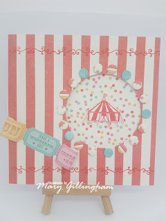
This card was made using both the paper pad and candi and also the Carnival stamps. 
  1. Cover the front of the card with the candy stripe paper and cut a circle out of the front. You can either draw around a household object and cut it out with a knife or you can run it through a die cutting machine.
  2. Stick a square of the confetti paper on the inside of the card.
  3. Taken the flourish stamp and stamping in red, stamp across the top of the card, about ¾” from the top and repeated this across the bottom of the card. 
  4. Cut out a strip of 3 tickets from the ticket paper and shape it by curling it around a pen or round tool. Stick to the front.
  5. Stick candi around the edge of the aperture. 
  6. Stamp the big top in the same red ink onto some smoothing stamping card and carefully cut around it with a knife; then layer it on 3D foam in the centre.

What I really like about this card, is that it would suit a male or female recipient and also you could change it round by using the different stamps, for example, using the carousel horse in the aperture.
A really simple card made just with the paper pad, yet still highly effective:

  1. Stick the confetti paper as a background on the front of your card blank.
  2. Cut 2 strips of tickets. It just so happens that 4 tickets fit perfectly along the top and bottom of the card as border strips! How cool is that?! 
  3. Cut out the bunting to write your message on the front. I went for ‘Lets Go Party’ but you can choose whatever message you fancy – the only restriction is the size of your card! 
The best bit about this paper is it’s versatility. You can use it to put names of people on the front, relatives, bespoke messages, anything! It’s so nice when a kit allows you to do that!


This card was made using just the stamps!!

  1. Stamp the ticket all over the card front, then using just 4 colours, coloured them in and cut some of them out to reveal ticket shaped apertures.
  2. Stamp the 'Celebrate' word onto a small rectangle with the flourish above and below, to add to the fairground look of it and stuck it to the front with 3D foam to add a bit of depth to the card.

A really simple, colourful, fun card but just with the stamps.
You could use this effect if you'd bought someone tickets for a present and change the colour scheme to whatever suits you - a little like a bespoke gift card for tickets!


Another super fun card! 
So I had time to demonstrate how to make a banner flag card from a card blank - did everyone catch it?

  1. Mark the centre point, connect the centre point with one of the bottom corners with a ruler and cut. Do the same again from the centre point to the other bottom corner to cut out the triangle.
  2. Cover the card with the amazing starburst paper, this really draws the eye into the card!
  3. Make a pinwheel from the candy stripe paper.
  4. Stamp some extra stars on the background and add candi in the corners.
  5. Stamp the 'PARTY' word onto a small rectangle and layered this on the front.

Perfect for any fun occasion, whether it's a party invitation or a birthday card!


Here’s some more carnival cards that I did for the show – I’d love to know what you think- either about my designs for the papers and stamps or the sample cards. Or even comment to share what your favourite fairground ride is!!


I hope you enjoy the collection!
Take care and happy crafting!


Sunday, 30 April 2017

A Closer Look at... Julie Loves Rainbows

Well I thought I'd share with you the samples I made for Julie's Create & Craft show on Sunday with her latest Julie Loves kit. The April kit was Rainbows and Oh. My. Word! What can I say - the colours are outstanding!! This is such a happy kit and an absolute delight to work with! It was so good, it sealed the deal on my decision to subscribe to the Julie Loves Creativity Box monthly subscription!! (I'll tell you about that another day!)

I love the project kit so much, there's everything you need in there and more! Everything co-ordinates, you can go for simple cards or more complex creations, you just can't lose.

So here's some of my samples for the show and a few instructions as to how I've made them, I hope you like them.....

This was one of my more simple cards, using the beautiful blue and green rainbow paper. I used a thin square frame from a second sheet of paper, rotated it to add a bit of contrast and give the effect of another matt and layer. I've taken 3 sizes of the butterflies and layered 3 folded butterflies for each one so they lift their wings - as if they're flying off the card!


I simply love these tent fold cards that open on the short side! They look so modern and just add something different to your project. To create the main feature on this card I've taken 2 foiled kraft artcards; I've cut an aperture in the oval one using a scalpel and layered it on top of the stems art card. I've used Kuretake Clean Color Real Brush pens (which are my absolute 'go to' pens) to colour the scalloped edge and the leaves. I've stamped 6 butterflies on one of the patterned papers and cut them out, layering each on top of another then simply tied a ribbon down the side.


This card was so simple and so much fun! It was excellent for using up those skinny scraps of paper which all of us keep but hardly ever use - we just keep them just in case. If you cover a piece of card with adhesive (I tried one piece with double sided tape and the other with tacky glue and both worked fine) then lay the strips of paper on diagonally. It will be different every time you make a different piece. Try different ways- go for a rainbow like I did above or just lay them down randomly and mix the colours for a completely different look! Really simply just added candi down the left hand side and one of the framed sentiments on the right hand side.


Oh goodness! I made this one using one of the new Reveal It designs! I used the Kuretake pens again in the same rainbow colours to draw stripes diagonally across the Reveal It, overlapping each colour slightly so the colours blend together. I've stuck a strip of the coloured Reveal It on top of a piece of rainbow paper and stuck them both to the front of the card with a framed sentiment. For those readers who haven't come across Reveal Its before - they are basically a coated cardstock with UV printed designs. The UV ink is completely clear and resists ink when you put it over the top. Personally, I find water based inks such as the pens or distress inks work best with them.


The last card I'd like to tell you about was using a Reveal It again but something a little different this time. I've coloured each individual rose in using the Kuretake pens in the same rainbow colours I've used in all the samples. Then I tried something a little different on the blank space (which I hadn't done before!) I used a black pen to colour in the blank space. I though it really made the colours and the roses pop off the page, especially when I mounted it on a piece of black card.

Here's the rest of the samples I made for Julie's show:


I hope you've enjoyed reading my blog post today and seeing my samples using the beautiful Julie Loves Rainbows Kit from Craftwork Cards. I've tried to put links to where I've got products from but if there's anything you'd like to ask about, or if there's something you like me to show you step-by-step, let me know, I'd love to know what you think 


Stampathon - Part 3 - Snowflake Kisses

Wow - three blog posts in under two weeks?! The mojo is clearly flowing with lots of projects and ideas in the pipeline :-) I'm really...